Background
Problems
I have to jump around a lot (between the website pages), and my attention is in all other places.
-- participant A
Complicated information architecture
From our comparative usability test between new and old parts of website, we noticed the newly designed Care of Children area has a more complicated IA structure, which frustrated participants.
Text-heavy content and legal terms
The old parts of the website contains dense legal instructions, leading to a lack of comprehension among users.
Interconnected links and navigational dead ends
The website’s workflow is not smooth, requiring users to click through several links to complete a task or find desired information. Besides, users tended to encounter dead ends, forcing them to backtrack and search for more hints.
Goals
Re-arrange the website structure with a better navigation experience.
Initiate the ministry staff the technics of upgrading the website.
Solutions
Information architecture workshop (IA Workshop)
Card sorting
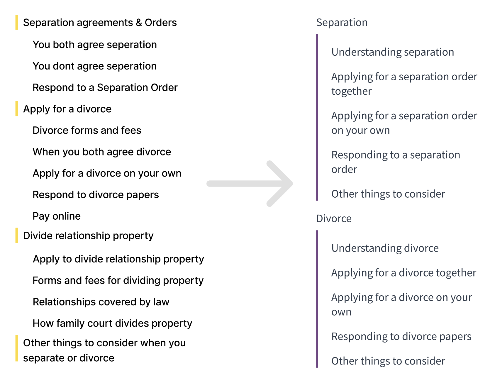
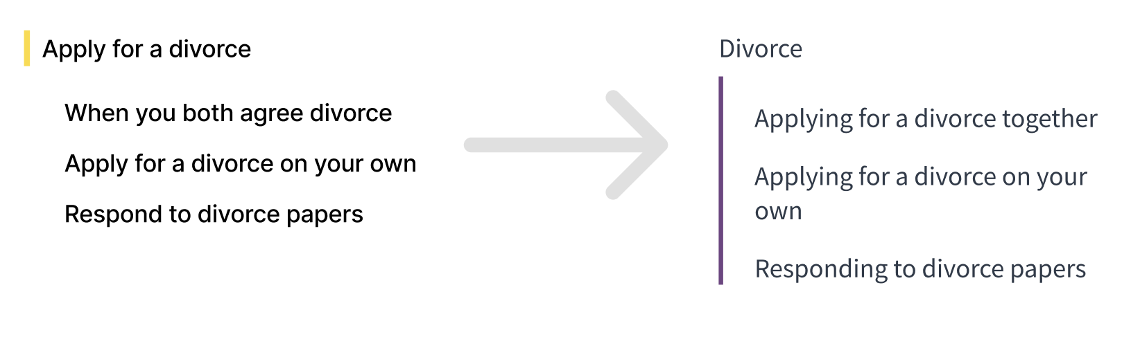
Categorize the cards with titles of web pages related to separation and divorce.
Title renaming
Ensure consistency in wording and grammar across the titles.
Content rearrangement
Rearrange the paragraphs of key pages.
Information architecture principles : based on the IA workshop
Categorize by tasks
Organize the pages by grouping relevant tasks together, making it easier for users to find the information they need based on the task they want to accomplish.
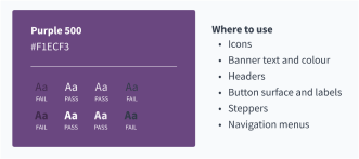
Consistency
Make sure the consistency in the titles and contents across all pages, helping users understand and navigate the website more easily.
Focus the user on the task
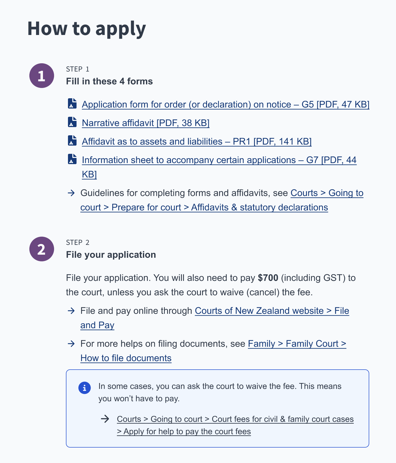
Ensure all relevant information for task completion is on a single page, eliminating the need to navigate to additional pages for supplementary information.
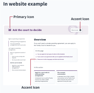
Design system : built upon optimized Care of Children design
Website prototype : showcasing our design system and IA principles
Key Features
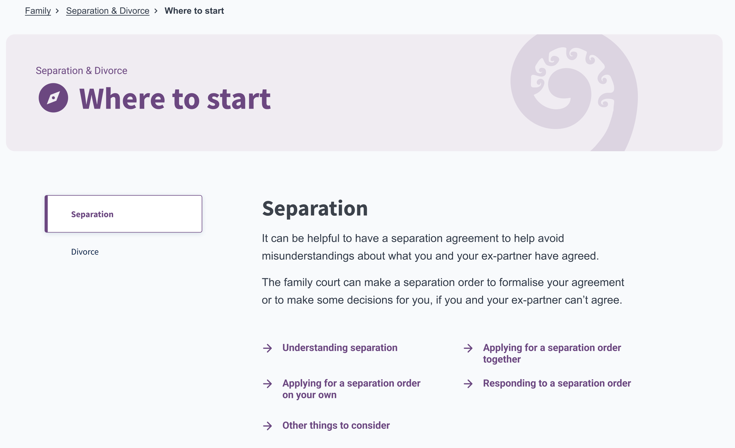
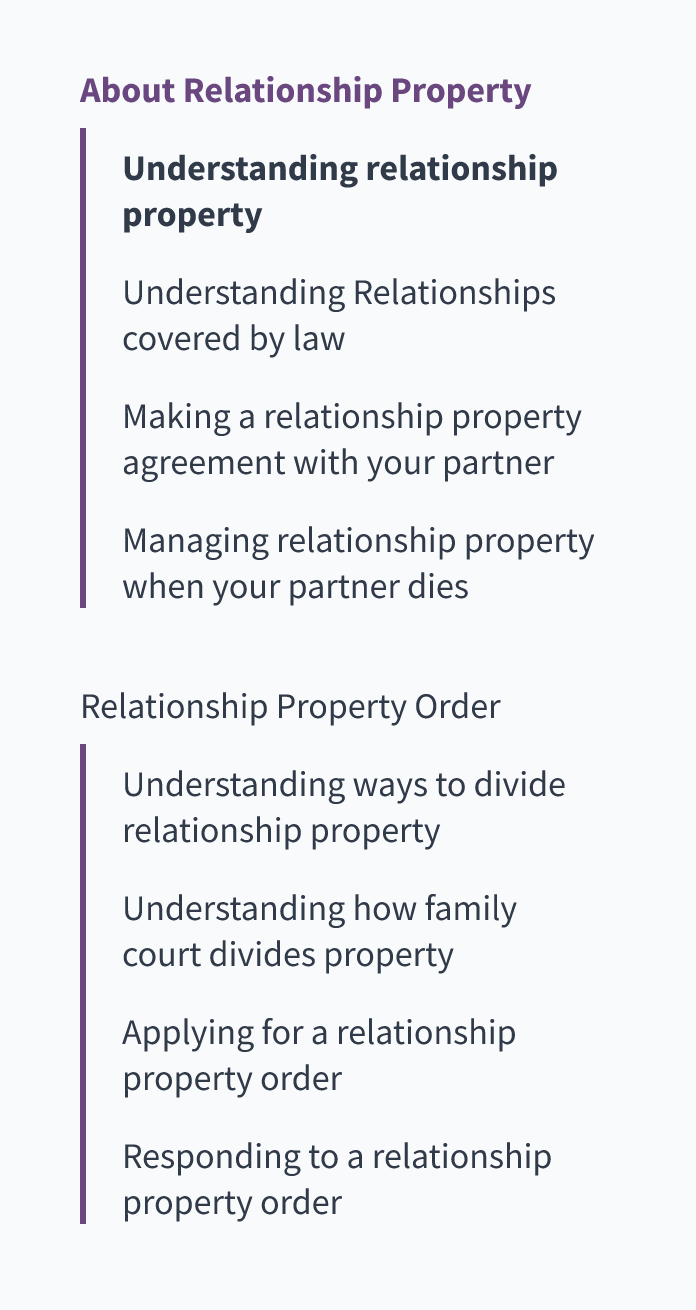
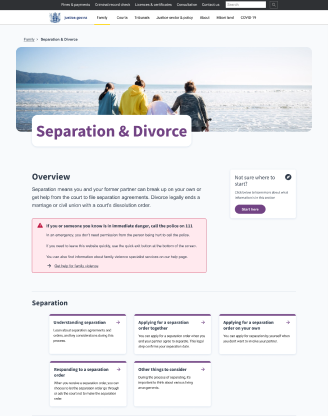
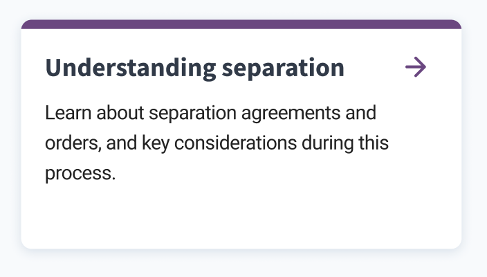
Simplified section map
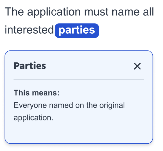
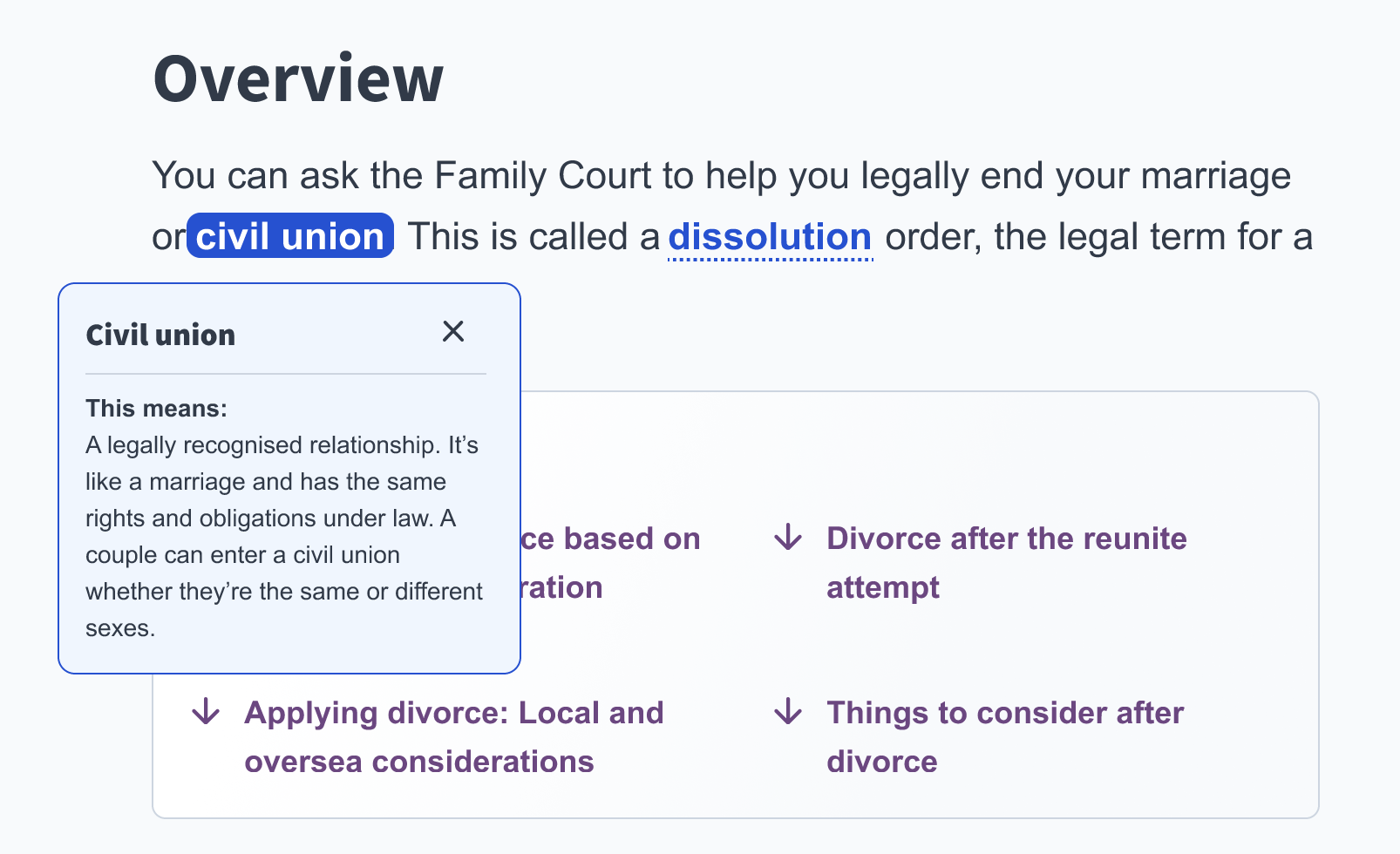
Consistent titles
Task-focused pages
Self-descriptive links

Future Steps
User testing with target users
Conduct usability test with target users, such as people seeking separation-related legal supports, to evaluate the effectiveness of the new structure and wording.
Online form
Convert all forms in the ministry’s website to digital format, allowing users to complete without the need to print. Digital forms streamline the application process, keeping it online and efficient. Additionally, online forms with progressive disclosure will prevent cognitive overload by presenting questions gradually.
Branching logic
Implement branching logic to provide a custom path based on a user's response. This will ensure users see the content relevant to their specific situation. The information gathered can be automatically brought into application forms, saving users time and effort on replying repetitive questions.